2025 Color Trends: The Shades Defining Next Year’s Interiors
Are you ready for a refresh that completely transforms the atmosphere of your home? The 2025 color palettes reflect a deep yearning for tranquility, nostalgia, and a connection to nature, while simultaneously offering bold new ways to explore self-expression and emotional balance.
Digital Twilights and Technological Nature
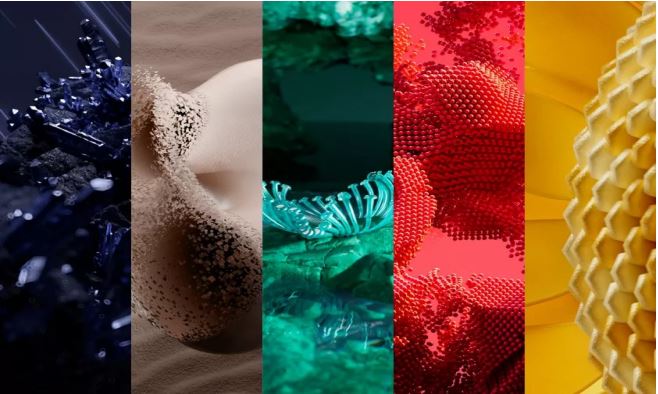
Global trend forecaster WGSN, in collaboration with Coloro, has named Future Dusk as the defining color of 2025. This moody, immersive blend of blue and purple evokes the mystery of twilight and encourages a quiet escape from the noise of daily life. Representing a period of profound change, this intriguing shade symbolizes the transition from shadow to light. In interior design, it offers a sophisticated way to create depth, particularly when used as an accent or paired with reflective, high-shine surfaces.
Alongside it emerges Aquatic Awe, a transformative turquoise. This shade celebrates the wonders of the natural world while possessing a synthetic, luminous quality that bridges the gap to the digital realm. Closely linked to themes of wellness and the protection of fragile oceanic ecosystems, these tones are ideal for rooms where the goal is clarity and freshness. For instance, ceramic tiles in similar mid-tones can create a soothing, oasis-like feel in bathrooms or kitchens. To achieve a particularly modern look, the Zinc Green Natural Hexagon is an ideal choice; its zinc-oxide-inspired surface perfectly captures this technological-natural trend.
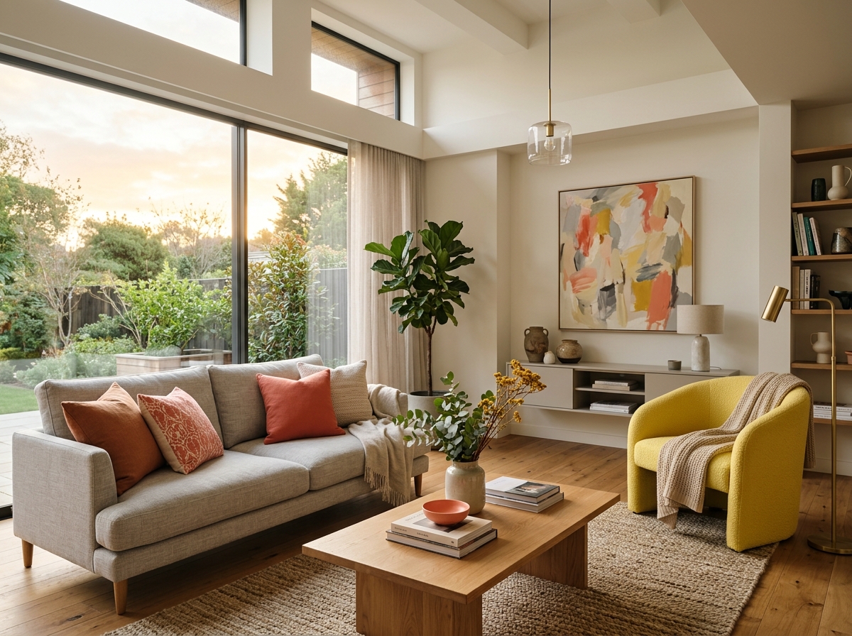
To inject optimism and vitality into a space, designers are turning to Sunset Coral and Ray Flower. Sunset Coral is a warm, inviting hue that promotes joy and a "slow living" philosophy. Ray Flower is a radiant, sun-drenched yellow that instills energy and connects the brilliance of the cosmos with the grounding elements of Earth. These shades are perfect for living spaces where a positive, active atmosphere is desired.
Grounding Earth Tones and Deep Burgundy
In contrast to these bold, tech-forward colors, 2025 also brings a focus on calming, cozy neutrals. Pantone has highlighted Mocha Mousse, a rich, warming brown that evokes the comfort of chocolate and coffee. This color provides stability and grounding, working beautifully alongside natural materials. A similar sense of security is offered by Transcendent Pink, which functions more as a restorative neutral than a traditional pink, creating a comforting and sophisticated backdrop.
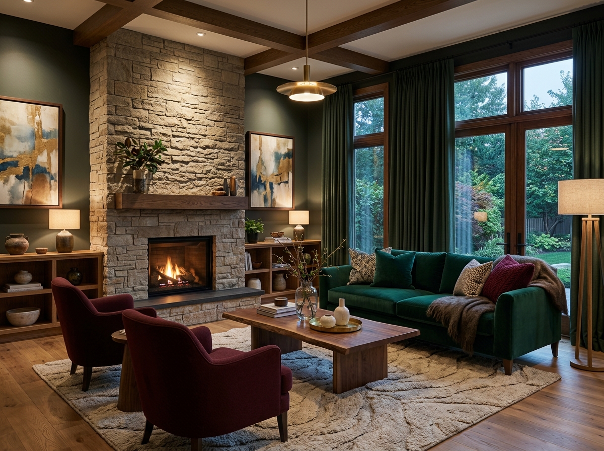
For those who prefer a more dramatic palette, the standout shade for 2025 is Rumors—a sophisticated dark red. This deep wine and burgundy tone is set to replace the bright tomato reds of previous seasons, offering a more mature and luxurious atmosphere. These deep tones are easy to integrate when paired with wallpapers that complement the room's overarching concept.
Forecasts from major paint brands, such as Benjamin Moore’s Cinnamon Slate, also point toward a velvety blend of plum and brown. This direction confirms that the 2025 interior is moving away from sterile grays and whites in favor of colors with character that tell a story. You can find more inspiration on how these shifts are shaping our homes in our blog post on Interior Design Trends 2025.
Color Psychology and Material Harmony
Choosing a color is more than an aesthetic preference; it directly impacts our well-being and productivity. Research confirms that blues and greens aid concentration and reduce stress, making them the gold standard for home offices and bedrooms. Conversely, warm earth tones and yellow shades boost energy levels and encourage social interaction, making them perfect for kitchens or living rooms.
To achieve a professional result, colors and materials must function as a cohesive whole. Interior designers often pair deep jewel tones with natural wood or stone to create a dignified, warm environment.
- Natural Wood: High-quality natural wood parquet provides a solid foundation that balances even the boldest wall colors.
- The Elegance of Natural Stone: Authentic natural stone tiles bring unique patterns and textures to a space that last for generations.
- Balancing Light and Hue: Successful design is based on understanding how materials react to light. You can read more about this in our article on how interior designers create balance.
In commercial design, 2025 marks a shift toward functional, purpose-driven palettes. Creative spaces utilize energetic yellows, while private meeting rooms favor calming greens or blues. The goal is a holistic use of color, where every element supports the other to create an inviting environment for both employees and clients.
Whether you are planning a major renovation or simply want to add a few trendy accents, the key colors of 2025 offer endless possibilities for creating a modern home with a personal touch. Explore our wide selection of finishing materials in the Vipex e-shop or visit our showroom to find the perfect match for your vision.