Mastering Color: How to Create a Harmonious and Cohesive Interior
Have you ever noticed how some rooms immediately instill a sense of calm, while others feel restless and cluttered? The secret to a harmonious interior lies in the psychology of color and the art of proportion. When executed correctly, these elements transform individual design pieces into a unified, visually balanced whole.
The Golden 60-30-10 Rule in Interior Design
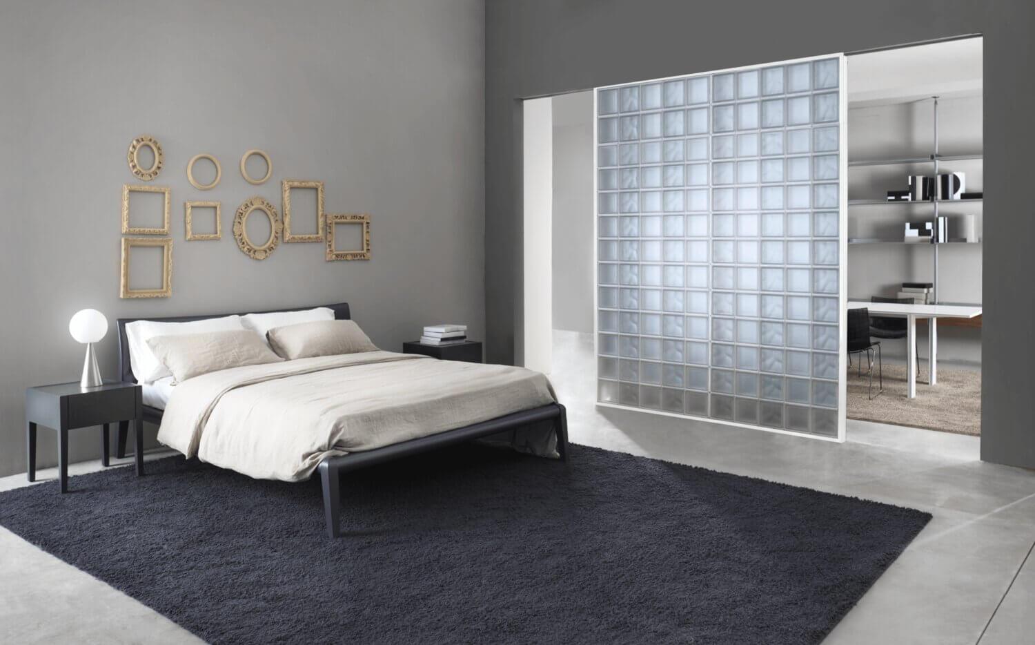
To achieve perfect balance, interior designers recommend following the 60-30-10 rule. This proportional approach prevents a space from feeling chaotic while leaving plenty of room for personal style.
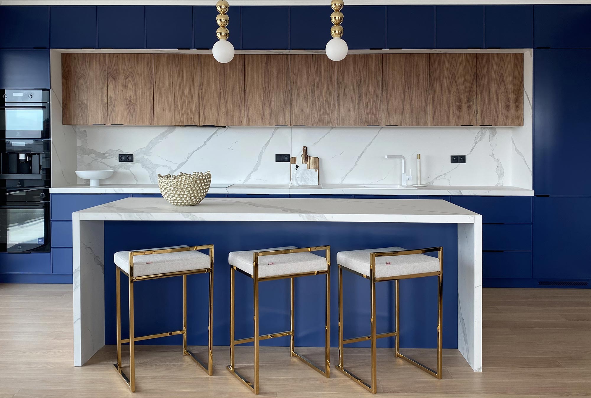
- 60 Percent (The Dominant Color): This serves as your primary shade and sets the overall tone for the room. It is typically applied to walls, ceilings, and large surfaces. When establishing this visual foundation, high-quality ceramic tiles are an ideal choice, as they provide a durable and permanent base for the entire design.
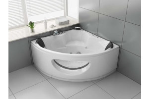
- 30 Percent (The Secondary Color): Your secondary color should complement the dominant tone, adding depth without overwhelming the space. In a bathroom, this role is often filled by functional bathroom furniture or larger pieces like cabinets and vanity units.
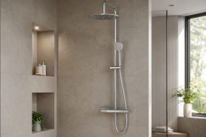
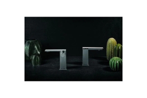
- 10 Percent (The Accent Color): The final portion is reserved for bold accents designed to catch the eye. Stylish bathroom lighting, artwork, or decorative hardware work perfectly as accents, allowing you to experiment with high-contrast shades in smaller doses.
Understanding Undertones and Visual Balance
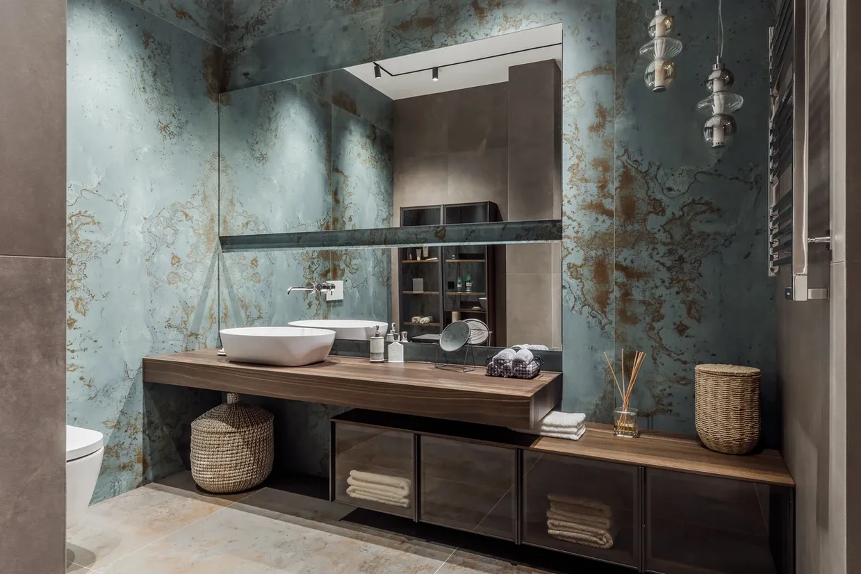
True color harmony depends on more than just the primary shades; it also relies on hidden undertones. If your base materials clash at the undertone level, the room may feel "off," even if the overall style is consistent. For example, creamy walls with warm undertones can visually clash with cool, blue-grey furniture. To maintain a professional look, ensure that large surfaces like floors and walls share the same "temperature"—either consistently warm or consistently cool.
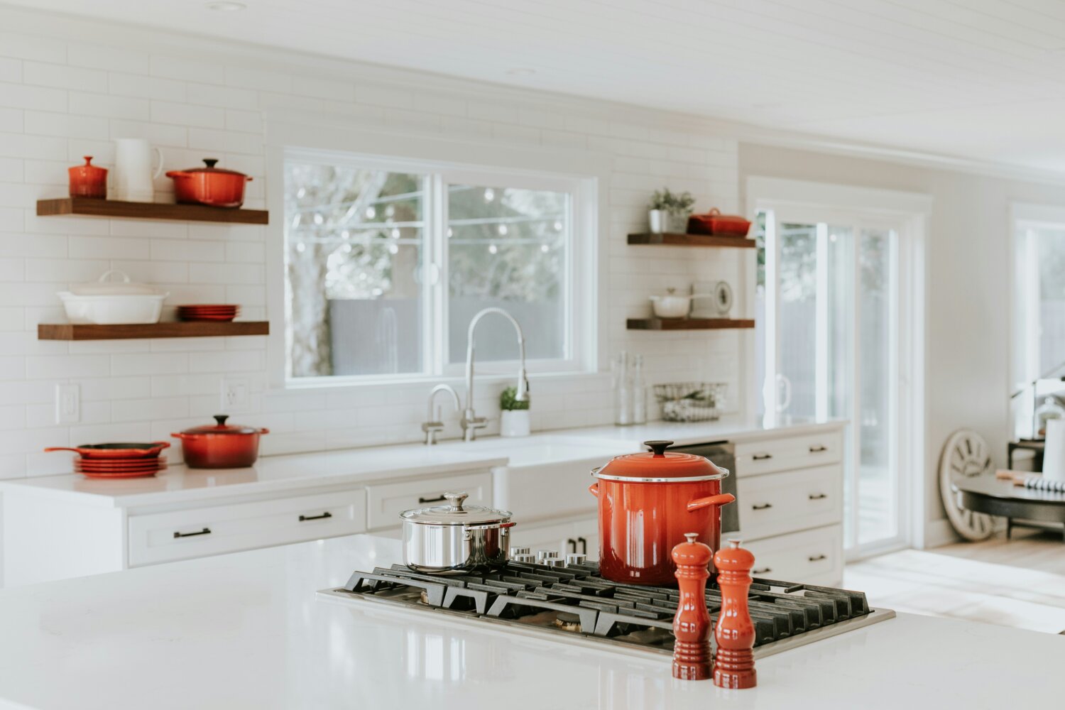
Once the foundation is set, you can introduce contrast through texture and finish. In a cool-toned room, wood textures and brass fixtures add necessary warmth; in a warm space, green plants or grey accessories provide a refreshing cooling effect. Texture also plays a vital role: matte finishes create a discreet, modern mood, while glossy surfaces add a sense of luxury and space. For instance, grey ceramic wall tiles with a classic pattern provide an excellent neutral backdrop that allows other design details to shine.
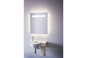
The Impact of Lighting on Color Perception
Lighting drastically changes how we perceive color. While natural daylight reveals the true essence of a shade, artificial lighting can significantly shift its appearance. Warm incandescent or "soft white" bulbs (2700K–3000K) enrich reds and yellows but can make blues and greens look dull. Conversely, cooler LED lighting (above 4000K) intensifies cool colors, giving them a clean, crisp, and clinical appearance.
Before making a final decision, it is highly recommended to test material samples in your space at different times of the day. When selecting finishes, it is worth reading expert advice on how to choose bathroom materials to ensure both functionality and aesthetic longevity. Light ceramic wall and floor tiles reflect light effectively to make a room feel more spacious, while darker accent tiles add sophisticated depth and focus.

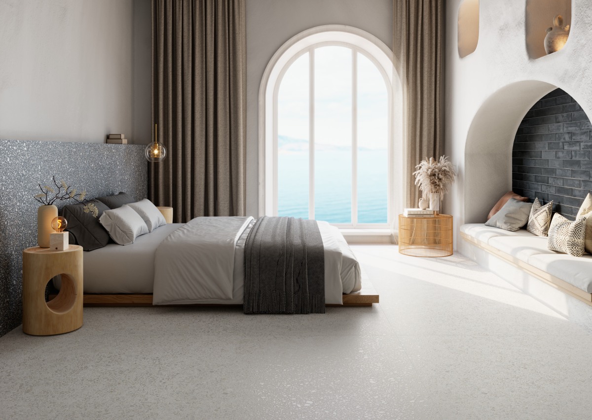
Room-Specific Solutions and Mood Setting
Color psychology is a powerful tool for supporting the purpose of a room. In home offices, blue and green tones promote concentration and endurance. In bathrooms and bedrooms, calming neutrals are preferred to facilitate relaxation. For those working with limited square footage, knowing how to make a small bathroom look bigger is key—this often involves a combination of light, glossy surfaces and strategic lighting.
For a modern and bold aesthetic, consider terrazzo-effect tiles like Arcana Stracciatella-R Nacar, which tie playful specks of color into a single cohesive surface. In commercial settings, such as shops or salons, the 60-30-10 rule helps guide the customer's eye and reinforce brand identity without the environment becoming overbearing.
Common Pitfalls in Color Selection
One of the most frequent mistakes is using too many bright colors, which leads to visual "noise" and fatigue. For a balanced interior, it is best to limit yourself to three main shades. Another common error is "sterility"—using exclusively cool tones without any warm accents can make a room feel cold and uninviting. A truly balanced palette always includes elements from both ends of the spectrum, even if one temperature is only present in a 10% capacity.
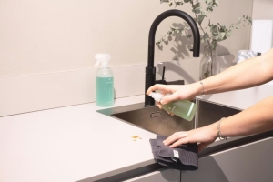
If you are unsure where to start, draw inspiration from timeless bathroom styles. When making your selections, prioritize durable ceramic tiles that will withstand years of use while maintaining their visual appeal.
Creating color harmony is a journey toward visual balance where every tile, faucet, and piece of furniture plays its part. By using the right proportions, considering the impact of light, and choosing high-quality materials, you can create an interior that supports both your emotional well-being and your daily needs.
Explore our wide range of ceramic tiles, sanitary ware, and furniture at the Vipex e-shop or visit our showroom to find the perfect tones for your dream interior.